Secondo il NYTimes il 40% degli scambi azionari non viene riportato perché internalzzato o perché avviene in un dark pool. Non riesco a capire come sia possibile avere un mercato efficiente in queste condizioni:
Visualizzazione post con etichetta mercato azionario USA. Mostra tutti i post
martedì 2 aprile 2013
lunedì 5 dicembre 2011
L'anno che verrà visto dal GIappone
Secondo gli analisti di Nomura i mercati si avviano alla fine dell'anno con un sentimento generale depresso (un po' meno nelle ultime 5 sedute): ai prezzi attuali i mercati scontano previsioni di crescita al ribasso ma non disastrose, come quelle che si realizzerebbero in caso di una crisi confrontabile a quella dell'autunno del 2008.
Se l'economia mondiale non sarà colpita una seconda volta da un fulmine (non proprio a ciel sereno ma pur sempre un fulmine) come il fallimento di Lehman Brothers nel 2008 i mercati azionari potrebbero persino prendersi una rivincita, soprattutto nei paesi emergenti, in Asia e in Europa.
Qui sotto potete leggere il report, grazie a scribd.com
NMA - 2012 - Global Strategy Outlook - 4 Dec 2011
Se l'economia mondiale non sarà colpita una seconda volta da un fulmine (non proprio a ciel sereno ma pur sempre un fulmine) come il fallimento di Lehman Brothers nel 2008 i mercati azionari potrebbero persino prendersi una rivincita, soprattutto nei paesi emergenti, in Asia e in Europa.
Qui sotto potete leggere il report, grazie a scribd.com
NMA - 2012 - Global Strategy Outlook - 4 Dec 2011
Etichette:
Asia,
Europa,
mercati emergenti,
mercato azionario USA
venerdì 18 marzo 2011
Elezioni anticipate negli USA?
Il ciclo presidenziale è molto popolare negli U.S.A....l'idea è che i primi due anni successivi all'insediamento di un Presidente sono gli anni di vacche magre per i mercati finanziari, mentre i due anni precedenti le elezioni, specialmente quello che le precede, sono gli anni di vacche grasse (perchè si adottano politiche espansive per conquistarsi la benevolenza degli elettori). Chart of the Day oggi pubblica un grafico che mostra quanto l'S&P500 si sia allontanato dalla media del pre-election year ... sembra quasi che le elezioni debbano arrivare con sei mesi di anticipo... fossi in Obama mi preoccuperei ....
N.B.: non sono serio! Questo tipo di grafici è totalmente inutile perchè non tiene conto della dispersione delle (poche) osservazioni rispetto alla media...la volatilità è tale che non penso che la correzione attuale sia neppure una deviazione standard al di sotto della media storica del ciclo.
Infine la teoria del ciclo presidenziale ha le gambe (statistiche) di argilla: il campione sulla quale è costruita è costituito da meno di una ventina di cicli...rimane solamente la consolazione anedottica che nessun anno pre-elezione si è chiuso negativamente per l'indice Dow Jones dal 1939 ad oggi.
N.B.: non sono serio! Questo tipo di grafici è totalmente inutile perchè non tiene conto della dispersione delle (poche) osservazioni rispetto alla media...la volatilità è tale che non penso che la correzione attuale sia neppure una deviazione standard al di sotto della media storica del ciclo.
Infine la teoria del ciclo presidenziale ha le gambe (statistiche) di argilla: il campione sulla quale è costruita è costituito da meno di una ventina di cicli...rimane solamente la consolazione anedottica che nessun anno pre-elezione si è chiuso negativamente per l'indice Dow Jones dal 1939 ad oggi.
Etichette:
cicli stagionali,
mercato azionario USA
giovedì 3 febbraio 2011
Attenti a quel 4%? L'inflazione e i mercati azionari
James Makintosh del Financial Times dedica un video alla relazione tra inflazione e mercati azionari. In particolare si concentra sulla tendenza dei mercati a una correzione quando l'inflazione è in aumento e supera la soglia critica del 4%.
Ho evidenziato in verde (risp. in rosso) i rendimenti medi annuali che si allontanano in positivo (risp. in negativo) più di due deviazioni standard dal mendimento medio annuale.
I lettori di Alfa o Beta? non saranno troppo sorpresi: nell'analisi della relazione tra inflazione (nei 12 mesi precedenti) e rendimento futuro delle azioni che trovate in questo post la soglia del 4% corrisponde al passaggio dal settimo all'ottavo decile della tabella che riproduco nuovamente qui sotto, con risultati decisamente poco entusiasmanti per i rendimenti azionari nei dodici mesi successivi.
| deviazione | ||||||
| standard | deviazione standard | |||||
| media dell' | media dell' | rendimento | rendimento | rendimento | del rendimento | |
| decili | inflazione | inflazione | futuro | futuro | futuro | medio |
| nei 12 mesi | nei 12 mesi | S&P500 | S&P500 | S&P500 | S&P500 | |
| precedenti | futuri | 6 mesi | 12 mesi | 12 mesi | 12 mesi | |
| 1 | -9,27 | -2,26 | 1,26 | 5,23 | 29,77 | 2,32 |
| 2 | -3,41 | 0,37 | 4,11 | 4,55 | 17,09 | 1,33 |
| 3 | -0,31 | 1,28 | 6,93 | 10,96 | 19,4 | 1,51 |
| 4 | 1,14 | 1,57 | 2,66 | 6,16 | 16,87 | 1,31 |
| 5 | 1,98 | 3,01 | 6,01 | 9,24 | 16,28 | 1,27 |
| 6 | 2,79 | 2,27 | 4,85 | 10,32 | 16,24 | 1,26 |
| 7 | 3,58 | 3,27 | 2,51 | 5,55 | 18,29 | 1,42 |
| 8 | 4,94 | 3,07 | -0,95 | 0,43 | 17,9 | 1,39 |
| 9 | 7,51 | 2,99 | 0,3 | 2,26 | 16,27 | 1,27 |
| 10 | 13,88 | 6,84 | 0 | 4,02 | 17,94 | 1,4 |
| media | 2,28 | 2,24 | 2,77 | 5,87 | 18,61 |
Ho evidenziato in verde (risp. in rosso) i rendimenti medi annuali che si allontanano in positivo (risp. in negativo) più di due deviazioni standard dal mendimento medio annuale.
Etichette:
inflazione,
mercato azionario USA,
rendimenti
martedì 11 gennaio 2011
Che la forza (relativa) sia con te: il poderoso effetto momento
I lettori di Alfa o Beta? sanno bene quanto efficace possa essere il momento come criterio di selezione di asset, visto che la classifica che pubblico settimanalmente si fonda proprio sulla loro forza (relativa), con risultati per niente disprezzabili. E non solo per l'asset allocation:
This was not unusual. Since the 1980s academic studies have repeatedly shown that, on average, shares that have performed well in the recent past continue to do so for some time. Longer-term studies have confirmed that this “momentum” effect has been observable for much of the past century. Nor is the phenomenon confined to the stockmarket. Commodity prices and currencies are remarkably persistent, rising or falling for long periods.
The momentum effect drives a juggernaut through one of the tenets of finance theory, the efficient-market hypothesis. In its strongest form this states that past price movements should give no useful information about the future. Investors should have no logical reason to have preferred the winners of 2009 to the losers; both should be fairly priced already.
(...) the momentum effect is huge. Elroy Dimson, Paul Marsh and Mike Staunton of the London Business School (LBS) looked at the largest 100 stocks in the British market since 1900. They calculated the return from buying the 20 best performers over the past 12 months and then holding them, rebalancing the portfolio every month.
This produced an annual average of 10.3 percentage points more than a strategy of buying the previous 12 months’ worst performers. An investment of £1 in 1900 would have grown into £2.3m by the end of 2009; the same sum invested in the losers would have turned into just £49 (see chart 1).
(...) A study by AQR Capital Management, a hedge fund, found that the American stocks with the best momentum outperformed those with the worst by more than ten percentage points a year between 1927 and 2010 (see chart 2).
L'effetto momento ha ormai più di un quarto di secolo di vita documentata, a partire dai primi studi accademici di Werner de Bondt e Richard Thaler datati 1985.
Oltre i 12-18 mesi tuttavia il momento tende a perdere efficacia:
Just as trees do not grow to the sky, share prices do not rise for ever. The effect tends to work for the best performers over the past 12 months, but not for those that have shone for longer periods, say three or five years.
The value of value
That may be because of another anomaly, the value effect. Investors eventually get too pessimistic about struggling firms, and price their shares too cheaply. That turns them into bargains. Broadly, whereas momentum works over the short term, value is successful over longer periods. The result can be sharp reversals in markets—and nasty surprises for momentum traders. One such turning-point occurred in 2009. Investors who used a short-term momentum strategy, buying the winners of the previous six months, would have lost 46% in the British market and 53% in America, according to the LBS team. Similarly bad years were 1975, 2000 and 2003.
The momentum effect allows investors to get rich slowly. But many fund managers are impatient and thus use leverage (borrowed money) to enhance returns. Such an approach would lose so much money in bad years that clients might lose faith. “To exploit momentum, you need investors who understand the portfolio is going to be subject to a very high level of volatility,” says Mr Marsh of the LBS.
Lo studio di AQR al quale si fa riferimento nel testo lo trovate qui sotto.
Case for Momentum Investing by AQR (Summer 09)
In conclusione: che la forza (relativa) sia con voi...May the force be with you...
mercoledì 5 gennaio 2011
Altri dieci anni di vacche magre? Secondo Shiller sì
Il rapporto prezzo/utili mediato su 10 anni (P/E10) è uno dei pochi indicatori ragionevolmente attendibili dei rendimenti futuri di lungo periodo (dai 10 anni in su). A partire dal livello attuale di questo rapporto (circa 23) Robert Shiller prevede un livello per l'indice S&P500 alla fine del 2020 appena superiore (+12%) all'attuale in dieci anni!
A conclusioni molto simili si giungeva con l'analisi discussa in un post di qualche mese fa. In questo post su seekingalpha si discute in dettaglio l'utilizzo del rapporto P/E10 per la valutazione del mercato azionario. L'inizio del mercato toro degli anni Ottanta e Novanta del secolo scorso coincise con un minimo del rapporto P/E10 intorno a 6.6, un valore che non veniva raggiunto dagli anni Trenta. Ai minimi del marzo 2009 il rapporto P/E10 era superiore a 13. C'è da sperare che il diverso quadro macroeconomico (in particolare il tasso di inflazione da lungo tempo vicino a zero, contrariamente alla situazione livello dei primi anni Ottanta) agisca da ammortizzatore e sostenga le valutazioni attuali, che indubbiamente sembrano un po' gonfiate...Nel video qui sotto potete sentire Robert Shiller che spiega la sua previsione per il 2020.
Etichette:
mercato azionario USA,
Valutazione
martedì 4 gennaio 2011
Meglio il cotone del Dow Jones!
Nel 2010 i prezzi del cotone e del palladio sono quasi raddoppiati (in dollari USA, in euro si può sopprimere il quasi).
I rendimenti azionari impallidiscono se confrontati con il poderoso rimbalzo delle materie prime. Anche in una prospettiva storica il 2010 è stato un anno buono per le azioni U.S.A., ma niente di più: l'istogramma qui accanto riassume i rendimenti delle azioni U.S.A. nei 186 anni dal 1825 a oggi: nel 70% dei casi i rendimenti sono stati positivi. Nel ventennio 1980-1999 solo due anni hanno avuto rendimenti (moderatamente) negativi mentre in ben 11 casi i rendimenti sono stati superiori al 20%. Tutt'altra musica nei dodici anni successivi: ben quattro gli anni con rendimenti negativi (anche pesantemente negativi come nel caso del 2002 e del 2008) e solamente nel 2003 e nel 2009 la borsa U.S.A. si è coraggiosamente spinta oltre il +20%. Infine è dal 1958 che non si vede un anno con un rendimento superiore al 40%.
Etichette:
materie prime,
mercato azionario USA
venerdì 31 dicembre 2010
Parole e numeri: l'ossessione di fine anno per le previsioni
Il New York Times ospita un dibattito sul bisogno e sui limiti delle previsioni. Tra i contributori vi segnalo Ray Kurzweil e Robert Shiller. Il primo fonda le sue previsioni su quella che chiama The law of accelerating returns, il cui esempio più celebre è la legge di Moore; su questa base così
conclude il suo articolo
A computer that fit inside a building when I was a student now fits in my pocket, and is a thousand times more powerful despite being a million times less expensive.
In another quarter century, that capability will fit inside a red blood cell and will again be a billion times more powerful per dollar.
Shiller invece si concentra sui limiti della prevsione in economia:
On economic predictions, statisticians and econometricians have some tools that can help forecast conditions, but they are rough. With "time series analysis," which uses data collected over time, one can see patterns, for example, of growth trends interrupted by recessions and recoveries.
But that method can't handle any revolutions, breakthroughs or fundamental change in the way data are generated. The failure to predict the current financial crisis could be considered one of these cases. Statisticians and econometricians can get the direction of the trend right but be off by a mile as to the level.
La lettera settimanale di commento ai mercati su etfworld.it è interamente dedicata agli auguri di fine anno: ottimista sul 2011 per la borsa statunitense, a proposito dell'ondata di iperottimismo che sembra essere il sentimento prevalente dei commentatori in questi ultimi giorni (date un'occhiata a questo articolo sul WSJ, ai miei post qui, qui e qui e alla discussione sul forum di finanzaonline.com segnalatami nei commenti da un lettore) il redattore del commento (a cura di Kairos Partners SGR) si esprime così:
Dire in questo momento che l’economia globale andrà bene e le borse saliranno è cantare in coro con tutti gli altri. In teoria dovrebbe essere
preoccupante, ma all’ampio consenso della teoria non corrispondono portafogli sovrapesati in azioni. Il profilo medio è ancora difensivo e liquidità e bond sono onnipresenti. Il posizionamento reale conta molto di più del sentiment ed è questo che renderà possibile l’espansione dei multipli e il rialzo azionario.
Che questo rialzo debba partire immediatamente in gennaio è un altro discorso. Vista dalla Fed, la borsa è per il momento già salita abbastanza, quel tanto cioè che è servito ad alimentare una buona stagione di acquisti natalizi e di saldi di gennaio. Ora potrebbe essere più importante stabilizzare i Treasuries e non spaventare troppo chi vuole chiedere un mutuo per comprare casa. Poi ci sarà l’Europa con tutti i suoi problemi.In pratica ci si potrà attenere a qualche semplice regola. In un anno propizio per la borsa non si dovrà mai essere sottopesati di azioni e sovrapesati di bond, neanche per un giorno. Per sovrapesare le azioni e sottopesare i bond si potrà però aspettare, opportunisticamente, una
fase di correzione o di paura. Si può dunque iniziare l’anno stando nel gruppo, senza cercare subito la fuga, e aspettare un momento più favorevole.
Investire sulla borsa americana potrà essere premiante anche in termini di cambio. Finché l’Europa non darà un segnale chiaro di volere riprendere in mano energicamente la situazione (come fu in maggio con la costituzione del fondo di salvataggio) l’euro sarà sotto pressione. Più avanti nell’anno, quando la Germania si deciderà a fare qualcosa di più per i paesi in difficoltà, l’euro potrà riprendersi. A medio termine, in ogni caso, non va dimenticato che ogni giorno che passa l’Europa riduce i suoi squilibri, mentre l’America vede crescere i suoi. Default o meno, nel 2015 tutta Eurolandia sarà ben al di sotto del 3 per cento di disavanzo e la Germania sarà addirittura in pareggio di bilancio. Dove sarà invece l’America, nessuno lo sa.
Nell'ultimo numero dell'Economist Buttonwood elenca le numerose fonti di preoccupazione per il 201, prima tra tutte la dipendenza delle banche e più in generale di tutto il settore finanziario e dell'economia dalle politiche espansive intraprese dalla Fed e dalla Banca Centrale Europea, che come effetto collaterale stanno gonfiando una bolla speculativa nei mercati emergenti. Alfa o Beta? condivide pienamente le conclusioni dell'articolo che vi riproduco qui sotto, soprattutto l'enfasi sul tempo scioccamente perduto da una politica troppo timida e non coordinata che non ha risolto nessuno dei problemi all'origine della crisi del 2008:
Whether all-out currency wars (in the form of trade protection) will emerge in 2011 is harder to tell. The aim of most developing countries is to prevent their currencies rising against the dollar at a faster pace than the Chinese yuan. Oddly enough, the European fiscal crisis eased some of the strains in late 2010: a weaker euro meant a stronger dollar.
But it is quite possible that the dollar could suffer another round of weakness in the coming year. After all, the currency has no yield support, a continuing trade deficit and the prospect of endless fiscal deficits. The sorry condition of municipal and state finances could yet be the trigger for a loss of confidence.
This list of problems is the reason why it is so hard for Buttonwood to join the bullish consensus for 2011. The authorities have kept the plates spinning by dint of an enormous effort and some unprecedented monetary measures. But the underlying problems have not been solved. And the law of gravity cannot be suspended for ever.
Tanti auguri a tutti i lettori per un sano, felice e prospero 2011!
conclude il suo articolo
A computer that fit inside a building when I was a student now fits in my pocket, and is a thousand times more powerful despite being a million times less expensive.
In another quarter century, that capability will fit inside a red blood cell and will again be a billion times more powerful per dollar.
Shiller invece si concentra sui limiti della prevsione in economia:
On economic predictions, statisticians and econometricians have some tools that can help forecast conditions, but they are rough. With "time series analysis," which uses data collected over time, one can see patterns, for example, of growth trends interrupted by recessions and recoveries.
But that method can't handle any revolutions, breakthroughs or fundamental change in the way data are generated. The failure to predict the current financial crisis could be considered one of these cases. Statisticians and econometricians can get the direction of the trend right but be off by a mile as to the level.
La lettera settimanale di commento ai mercati su etfworld.it è interamente dedicata agli auguri di fine anno: ottimista sul 2011 per la borsa statunitense, a proposito dell'ondata di iperottimismo che sembra essere il sentimento prevalente dei commentatori in questi ultimi giorni (date un'occhiata a questo articolo sul WSJ, ai miei post qui, qui e qui e alla discussione sul forum di finanzaonline.com segnalatami nei commenti da un lettore) il redattore del commento (a cura di Kairos Partners SGR) si esprime così:
Dire in questo momento che l’economia globale andrà bene e le borse saliranno è cantare in coro con tutti gli altri. In teoria dovrebbe essere
preoccupante, ma all’ampio consenso della teoria non corrispondono portafogli sovrapesati in azioni. Il profilo medio è ancora difensivo e liquidità e bond sono onnipresenti. Il posizionamento reale conta molto di più del sentiment ed è questo che renderà possibile l’espansione dei multipli e il rialzo azionario.
Che questo rialzo debba partire immediatamente in gennaio è un altro discorso. Vista dalla Fed, la borsa è per il momento già salita abbastanza, quel tanto cioè che è servito ad alimentare una buona stagione di acquisti natalizi e di saldi di gennaio. Ora potrebbe essere più importante stabilizzare i Treasuries e non spaventare troppo chi vuole chiedere un mutuo per comprare casa. Poi ci sarà l’Europa con tutti i suoi problemi.In pratica ci si potrà attenere a qualche semplice regola. In un anno propizio per la borsa non si dovrà mai essere sottopesati di azioni e sovrapesati di bond, neanche per un giorno. Per sovrapesare le azioni e sottopesare i bond si potrà però aspettare, opportunisticamente, una
fase di correzione o di paura. Si può dunque iniziare l’anno stando nel gruppo, senza cercare subito la fuga, e aspettare un momento più favorevole.
Investire sulla borsa americana potrà essere premiante anche in termini di cambio. Finché l’Europa non darà un segnale chiaro di volere riprendere in mano energicamente la situazione (come fu in maggio con la costituzione del fondo di salvataggio) l’euro sarà sotto pressione. Più avanti nell’anno, quando la Germania si deciderà a fare qualcosa di più per i paesi in difficoltà, l’euro potrà riprendersi. A medio termine, in ogni caso, non va dimenticato che ogni giorno che passa l’Europa riduce i suoi squilibri, mentre l’America vede crescere i suoi. Default o meno, nel 2015 tutta Eurolandia sarà ben al di sotto del 3 per cento di disavanzo e la Germania sarà addirittura in pareggio di bilancio. Dove sarà invece l’America, nessuno lo sa.
Nell'ultimo numero dell'Economist Buttonwood elenca le numerose fonti di preoccupazione per il 201, prima tra tutte la dipendenza delle banche e più in generale di tutto il settore finanziario e dell'economia dalle politiche espansive intraprese dalla Fed e dalla Banca Centrale Europea, che come effetto collaterale stanno gonfiando una bolla speculativa nei mercati emergenti. Alfa o Beta? condivide pienamente le conclusioni dell'articolo che vi riproduco qui sotto, soprattutto l'enfasi sul tempo scioccamente perduto da una politica troppo timida e non coordinata che non ha risolto nessuno dei problemi all'origine della crisi del 2008:
Whether all-out currency wars (in the form of trade protection) will emerge in 2011 is harder to tell. The aim of most developing countries is to prevent their currencies rising against the dollar at a faster pace than the Chinese yuan. Oddly enough, the European fiscal crisis eased some of the strains in late 2010: a weaker euro meant a stronger dollar.
But it is quite possible that the dollar could suffer another round of weakness in the coming year. After all, the currency has no yield support, a continuing trade deficit and the prospect of endless fiscal deficits. The sorry condition of municipal and state finances could yet be the trigger for a loss of confidence.
This list of problems is the reason why it is so hard for Buttonwood to join the bullish consensus for 2011. The authorities have kept the plates spinning by dint of an enormous effort and some unprecedented monetary measures. But the underlying problems have not been solved. And the law of gravity cannot be suspended for ever.
Tanti auguri a tutti i lettori per un sano, felice e prospero 2011!
Etichette:
mercato azionario Europa,
mercato azionario USA
giovedì 30 dicembre 2010
L'indice Dow Jones a quota 20000 in meno di tre anni?
Un altro supertoro: Larry Robbins, eccellente manager del fondo hedge Glenview Institutional Partners (dal febbraio 2001 a oggi il fondo ha avuto un rendimento pari al 17.5% annuo composto al lordo di imposte e fees), ritiene che l'indice Dow Jones potrebbe superare quota 20000 entro la fine del 2013!
Speriamo bene! Vi ricordate il famosissimo libro Dow 36000, di James K. Glassman e Kevin A. Hassett, pubblicato nel 1999, pochi mesi prima dello scoppio della bolla internet? Il Dow raggiunse un massimo storico a 11,750.28 nel gennaio del 2000...il resto è storia...ieri sera, dopo quasi 11 anni, ha chiuso a 11585....
Armati di amuleti e dopo opportune danze scaramantiche potete leggere un estratto della lettera di Robbins ai suoi investitori qui
Speriamo bene! Vi ricordate il famosissimo libro Dow 36000, di James K. Glassman e Kevin A. Hassett, pubblicato nel 1999, pochi mesi prima dello scoppio della bolla internet? Il Dow raggiunse un massimo storico a 11,750.28 nel gennaio del 2000...il resto è storia...ieri sera, dopo quasi 11 anni, ha chiuso a 11585....
Armati di amuleti e dopo opportune danze scaramantiche potete leggere un estratto della lettera di Robbins ai suoi investitori qui
Etichette:
mercato azionario USA,
Valutazione
giovedì 23 dicembre 2010
Troppo entusiasmo fa male ai mercati, troppo pessimismo fa bene ai mercati.
L'Associazione Americana degli Investitori Individuali (AAII) dal 1987 settimanalmente fa un sondaggio tra i suoi membri sulle prospettive future dei mercati azionari. La domanda posta è molto semplice: si chiede di prevedere se nei sei mesi successivi i mercati saranno in rialzo (bullish), in ribasso (bearish) oppure semplicemente pressochè invariati e privi di una direzione definita (neutral). I risultati del sondaggio espressi in forma percentuale formano la cosiddetta AAII Investor Sentiment Survey che cositituisce la più lunga serie storica di indicatori di sentiment (umore, attese, ...) sui mercati azionari. La serie storica completa può essere scaricata a questo link, mentre qui trovate un articolo di Wayne Thorp su come e perchè questa serie possa essere utilizzata come indicatore di tipo contrarian. L'idea fondamentale è di concentrare l'attenzione sui valori estremi della serie storica, che si discostano considerevolmente delle medie storiche:
- bullish 39% con una deviazione standard del 10.7%
- neutral 31% con una deviazione standard del 9%
- bearish 30% con una deviazione standard del 10%
Lo spread tori-orsi atteso dovrebbe aggirarsi quindi intorno al 10% ma un range compreso tra -20% e 40% è da considerarsi normale (anche se sempre più preoccupante avvicinandosi i valori estremi). Negli ultimi due decenni i dati molto lontani da questo range hanno spesso coinciso con i valori estremi dell'oscillazione dei mercati. Ad esempio bearish sentiment raggiunse un valore recordo al 70.3% il 5 Marzo 5 del 2009, in quasi perfetta coincidenza con il minimo del terribile mercato orso 2008-2009 (si veda anche questo post su Alfa o Beta?.
L'ultimo dato settimanale è abbastanza allarmante: lo spread tori-orsi si attesta al 47%, indicativo di un entusiasmo che potrebbe riverlarsi eccessivo, ancor più tale se si tiene conto che viene dopo 15 settimane consecutive di spread tori-orsi significativamente al di sopra della media storica:
Qualche parola di cautela sull'uso di questo tipo di indicatori: la prima è la limitatezza del campione statistico utilizzato. Come osserva il Wall Street Journal in un recente articolo dedicato proprio all'AAII Sentiment Survey
Just 200 to 300 investors respond each week, less than 0.2% of the association's 150,000 dues-paying members, according to the Chicago-based group, which doesn't publish the sample size. Among them are a large number of retirees, the AAII says—giving this tiny slice of the investing community an unusual amount of sway over Wall Street.
From a strict, statistical perspective, the AAII's survey is "pretty much useless," said David Madigan, professor and head of the Department of Statistics at Columbia University, who is particularly troubled by survey's reliance on voluntary self-reporting.
L'evidenza punta però nella direzione contraria: la serie in passato se l'è cavata discretamente, specialmente per individuare i punti di inversione dei mercati, sopratutto intorno ai minimi:
And despite its formidable statistical limitations, the survey has been surprisingly useful as a marker of turning points, especially market bottoms.
"It's almost like clockwork," said Al Frank's Mr. Buckingham. "The reaction is immediate and it's fascinating."
For instance, on March 5, 2009, the AAII survey registered its lowest bullish reading in 17 years. Days later, the Dow Jones Industrial Average embarked on a 13-month bull run that sent it up more than 80%. This year, in late August, bearishness jumped to its highest point of the past five months, just as the Dow began a 14% rally.
Alan Zafran, partner of Menlo Park, Calif.-based Luminous Capital, which manages $3.8 billion of assets, says fellow hedge-fund managers told him they dumped some of their positions after a Nov. 11 reading this year showed bullishness spiking to a near four-year high. The market fell 3% over the next five days.
Birinyi Associates has been following the survey for years, using the difference, or spread, between the bulls and the bears as an indicator of where the market may head. Birinyi uses a four-week moving average. The results are noteworthy: On the 16 occasions since the early 1990s that bears have outnumbered bulls by at least 10%, the Standard & Poor's 500 has gone on to rally an average 6.2% gain over the next six months.
And when optimism gets too frothy, and bulls outnumber bears by at least 30%, the S&P 500 has tended to fall over the next six months, according to Birinyi.
Ecco qui i risultati di un piccolo studio che ho fatto concentrandomi sulle letture estreme della serie: ho evidenziato in rosso e in verde i dati che si discostano in modo statisticamente significativo dalla media (oltre due deviazioni standard della distribuzione dei valori medi, tenuto conto del numero di osservazioni)
| Spread | numero | rendimento | rendimento | rendimento | rendimento |
| tori-orsi | osservazioni | futuro | futuro | futuro | futuro |
| medio | medio | medio | medio | ||
| 1 mese | 3 mesi | 6 mesi | 12 mesi | ||
| +50% «» +63% | 13 | -1,22% | -3,56% | -2,87% | -2,47% |
| +45 «» +49% | 20 | -0,95% | -0,95% | -1,23% | -3,84% |
| +40% «»+44% | 34 | 0,06% | -0,40% | -0,92% | 0,07% |
| +35% «» +39% | 38 | 0,05% | 0,71% | 1,55% | 3,93% |
| +30% «» +34% | 44 | 0,11% | 2,64% | 4,09% | 9,15% |
| +25% «» +29% | 83 | -0,23% | 0,69% | 1,90% | 5,72% |
| -15% «» -19% | 39 | -0,44% | 3,60% | 5,22% | 8,03% |
| -20% «» -24% | 35 | 0,37% | 1,97% | 5,11% | 11,51% |
| -25% «» -29% | 25 | 2,19% | 2,52% | 3,41% | 8,32% |
| -30% «» -34% | 16 | 2,49% | 0,59% | 3,01% | 0,09% |
| -35% «» -54% | 14 | 0,94% | 7,23% | 15,97% | 17,63% |
| tutto il campione | 1225 | 0,55% | 1,76% | 3,78% | 8,18% |
| deviazione | |||||
| standard | 4,46% | 8,05% | 11,56% | 17,65% |
A conclusioni simili si giunge anche analizzando semplicemente le letture estreme del sentimento bullish o bearish come mostra la tabella riprodotta qui sotto e tratta dall'articolo di Wayne Thorp del 2004 citato sopra
Etichette:
mercato azionario USA,
serie storiche
lunedì 20 dicembre 2010
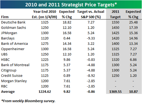
L'anno che verrà nelle previsioni degli analisti di Wall Street
Sul sito di CNBC potete invece leggere una lista di previsioni "azzardate" per il 2011: il link è questo ma ho elencato alcune di quelle più pertinenti al tema degli investimenti e dell'economia qui sotto per vostra comodità
- The Fed Ends QE2 Program in June
- Stocks will rally big time. Secondo l'ex-portavoce della Casa Bianca Tony Fratto alla fine del 2011 l'indice Dow Jones si attesterà intorno a 14,000, con un progresso vicino al 22%. Why? Highly productive firms only need a little growth right now to blow the doors off. They won’t get a lot of growth in 2011 in the U.S., but with high productivity, strong global growth, and fewer competitors, they’ll get enough. Mah...se lo dice lui!
- Euro Weakens Further, Nearing Parity With the Dollar. Almeno questa è l'opinione di Guy Johnson che presenta l'European Closing Bell su CNBC. Secondo Johnson la Grecia dovrà ristuturare il debito e così pure la Spagna mentre Irlanda e Portogallo se la caveranno con un pacchetto di aiuti congiunto dell'UE-FMI.
- America's Inflation Problem Becomes Evident
- Crude Oil Prices Surge Past $100. Secondo la giornalista di CNBC Melissa Francis una parte della colpa sarà del dollaro: Even though the dollar gets a bounce from the safety trade, especially when investors are running from European default, the trend in the dollar is lower as we dig ourselves deeper into debt. Another reason is the fundamentals. As economies around the world recover, we'll keep gulping down that light sweet crude in greater quantities.
Etichette:
mercato azionario USA
giovedì 4 novembre 2010
Azioni per il lungo periodo? Nooo! Obbligazioni? Forse. Ma la speranza non muore mai...
Global Financial Data è una compagnia U.S.A. specializzata nella costruzione e distribuzione di lunghe serie storiche economiche e finanziarie (vendute a caro prezzo...): rendimenti azionari dal 1693, inflazione dal 1209, rendimenti obbligazionari dal 1520 e così via. Il grafico dell'indice S&P500 dal 1791 a oggi è davvero impressionante: per più di un secolo non è andato da nessuna parte, altro che azioni per il lungo periodo! Chi avesse investito nel 1791 dopo 100 anni si sarebbe ritrovato con rendimenti nominali negativi.
I rendimenti reali sarebbero stati solo un po' meno peggiori visto che l'indice dei prezzi al consumo U.S.A. tra il 1791 e il 1891 ha perso il 3%, secondo la serie storica gratuita del CPI messa a disposizione da www.measuringworth,com e che potete trovare qui.
Un altro grafico divertente tratto dal sito di Global Financial Data è quello dell'andamento del titolo azionario della Banca di Inghilterra dal 1694 al 1930: notate che la scala qui non è semilogaritmica bensì lineare, quindi in 236 anni il titolo ha messo a segno un rialzo del 350%. Niente di esaltante per un cassettista armato di pazienza plurisecolare come non se ne vedono più da tempo...
Ok, ok, le azioni non sono per il lungo periodo....ma le obbligazioni? Beh, in questo caso forse le cose vanno meglio, anche se c'è ancora da considerare il rischio politico: ecco l'andamento del prezzo dell'obbligazione Russa al 5% nominale dal 1821 al....1930....
E' impressionante vedere la diminuzione di prezzo (e dunque l'aumento dei tassi, cioè del risk premium) in corrispondenza del 1848 (vi ricordate qualcosa dai libri di storia delle superiori), della guerra di Crimea, la ripresa del ventennio 1877-1897 e quella successiva alla rivoluzione del 1905 fino al crollo del titolo con la rivoluzione bolscevica: curioso però che ancora nel 1926 il prezzo non fosse sceso a zero...la speranza, in questo caso leggi "speculazione", non muore mai!
I rendimenti reali sarebbero stati solo un po' meno peggiori visto che l'indice dei prezzi al consumo U.S.A. tra il 1791 e il 1891 ha perso il 3%, secondo la serie storica gratuita del CPI messa a disposizione da www.measuringworth,com e che potete trovare qui.
Un altro grafico divertente tratto dal sito di Global Financial Data è quello dell'andamento del titolo azionario della Banca di Inghilterra dal 1694 al 1930: notate che la scala qui non è semilogaritmica bensì lineare, quindi in 236 anni il titolo ha messo a segno un rialzo del 350%. Niente di esaltante per un cassettista armato di pazienza plurisecolare come non se ne vedono più da tempo...
Ok, ok, le azioni non sono per il lungo periodo....ma le obbligazioni? Beh, in questo caso forse le cose vanno meglio, anche se c'è ancora da considerare il rischio politico: ecco l'andamento del prezzo dell'obbligazione Russa al 5% nominale dal 1821 al....1930....
E' impressionante vedere la diminuzione di prezzo (e dunque l'aumento dei tassi, cioè del risk premium) in corrispondenza del 1848 (vi ricordate qualcosa dai libri di storia delle superiori), della guerra di Crimea, la ripresa del ventennio 1877-1897 e quella successiva alla rivoluzione del 1905 fino al crollo del titolo con la rivoluzione bolscevica: curioso però che ancora nel 1926 il prezzo non fosse sceso a zero...la speranza, in questo caso leggi "speculazione", non muore mai!
Etichette:
asset allocation,
mercato azionario USA,
serie storiche
mercoledì 3 novembre 2010
Il ciclo presidenziale e l'anno che verrà.
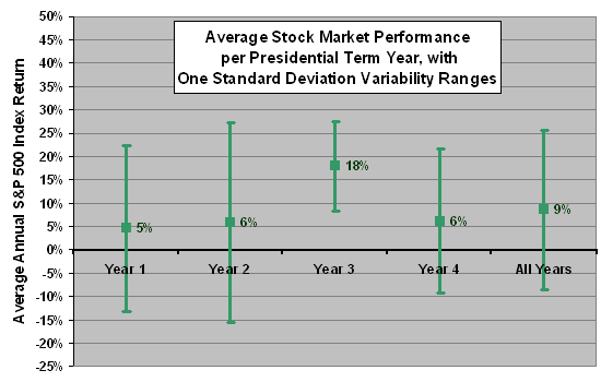
Il supplemento Plus del Sole 24 Ore di sabato scorso dedica un articolo al ciclo presidenziale, secondo il quale i listini azionari soffrono particolarmente il primo biennio di ogni presidenza U.S.A. mentre sono più generosi nel secondo biennio (particolarmente nel terzo anno, quello che precede le elezioni, proprio il 2011 nel caso della presidenza Obama). Questo tipo di analisi è molto popolare negli Stati Uniti, anche grazie al popolarissimo Stock Trader Almanac, curato da e giunto ormai alla sua 44esima edizione annuale. Nell'introduzione dell'edizione 2010, scritta oltre un anno fa, si faceva riferimento al fatto che il 2010 è un Midterm election year,
tradizionalmente il secondo del ciclo quadriennale, con rendimenti migliori soltanto dell'anno post-elezioni. Secondo l'almanacco 2010, proprio sulla base dell'analisi del ciclo presidenziale, non si può escludere un rally che dai minimi del Midterm Year si spinga fino a raggiungere un picco l'anno successivo con un rialzo medio di poco inferiore del 50%, e comunque nel 90% dei casi superiore al 23%. Se come minimo per il 2010 si confermasse quello toccato nel luglio scorso (intorno a 9600 per il Dow Jones), il 2011 potrebbe dunque vedere un rialzo fino ad un massimo che nell'ipotesi più prudente si collocherebe a un livello poco superiore a quello attuale, mentre se confermasse le medie storiche potrebbe spingere l'indice Dow Jones a un massimo intorno a 14400 !! Ecco i sogni selvaggi che si possono alimentare con una tabellina come quella che riporto qui accanto.
I rendimenti annuali per ogni ciclo presidenziale dal 1897 al 2007 li potete trovare in questo file acrobat riassunti da Ned Davis Research: utilizzando come indice di riferimento l'indice Dow Jones Industrial Average ecco una tabella che riassume i risultati calcolati sui 25 cicli presidenziali considerati
Election Post-Election Mid-Term Pre-Election
Year Year Year Year
% anni positivi 70.4 48.1 55.6 81.5
guadagno
totale % 242.1 134.0 100.4 341.4
rendimento annuale
medio % 9.0 5.0 3.7 12.6
rendimento annuale
mediano % 7.6 -0.6 2.1 15.2
Nello Stock Trader Almanac 2010, a pagina 130, è riportata una analisi simile estesa però fino al 1833, per complessivi 43 cicli. Ecco come cambia la tabella di cui sopra se si estende in questo modo l'analisi
Election Post-Election Mid-Term Pre-Election
Year Year Year Year
% anni positivi 65.9 44.2 59.1 75.0
guadagno
totale % 254.5 67.3 176.0 464.0
rendimento annuale
medio % 5.8 1.6 4.0 10.5
La migliore discussione sul ciclo presidenziale di cui sono a conoscenza è quella degli analisti di CXO, che cercano di valutare la signficatività statistica di questo tipo di risultati, e dalla quale ho tratto la figura che vi ripropongo qui sotto: l'unico anno che sembra avere qualche chance di scostarsi significativamente dalla media è proprio il terzo, quello pre-elettorale. Abbastanza per alimentare qualche sogno per il 2011, anche se considerevolmente meno selvaggio di quello che vi ho descritto sopra. Attenzione però a non dimenticare che questo tipo di analisi si basa su campioni molto molto piccoli: la confidenza in qualsiasi conclusione basata su un'analisi statistica come quelle riportate oggi è necessariamente davvero molto bassa.
Etichette:
cicli stagionali,
mercato azionario USA
sabato 23 ottobre 2010
140 anni di rendimenti azionari
E' sempre interessante dare un'occhiata all'andamento dei mercati azionari su scale temporali molto lunghe. Chartoftheday propone un grafico dell'indice Dow Jones dal 1900 ad oggi, al netto dell'inflazione
Alcuni spunti interessanti dal commento che accompagna il grafico:
...when adjusted for inflation, the bear market that concluded in the early 1980s was almost as severe as the one that concluded in the early 1930s. Also, the inflation-adjusted Dow is a little more than double where it was at its 1929 peak and trades 65% above its 1966 peak -- not that spectacular of a performance considering the time frames involved.
Davvero impressionante pensare che nel marzo del 2009 l'indice era di poco superiore al picco del 1966. Con i dati relativi all'indice S&P500 messi a disposizione da Shiller sulla sua webpage si può estendere il grafico fino al 1870
L'impressione è che se si considerano anche gli ultimi 30 anni del XIX secolo la pendenza sia un po' inferiore a quella degli ultimi 110 anni, e che ci sia spazio per ulteriore mean reversion....al ribasso però. Ecco il risultato di un fit esponenziale sui dati, vi faccio notare che R^2 è molto alto (0.75). Il rendimento al netto dell'inflazione che meglio interpola i 140 anni di rendimenti è pari all'1.7%. Prima che vi facciate vincere dallo sconforto è bene sottolineare che il calcolo non tiene conto dei dividendi, il cui rendimento reale medio nei 140 anni presi in considerazione è stato del 4.5%, portando il rendimento medio delle azioni al netto dell'inflazione a un più che onorevole 6.2%. Peccato però che il dividend yield sia ormai da più di un decennio molto più basso, inferiore al 2% dal 1997 (con l'eccezione del biennio 2008-2009 in cui ha superato il 2% fino a sfiorare il 3.5% al picco della crisi). Sembra quindi poco probabile che nei prossimi 5-10 anni le azioni U.S.A. possano garantire rendimenti reali in linea con le medie storiche, un risultato in linea con quanto si ottiene dalla valutazione dell'indice tenendo conto dei profitti come discusso qui.
...when adjusted for inflation, the bear market that concluded in the early 1980s was almost as severe as the one that concluded in the early 1930s. Also, the inflation-adjusted Dow is a little more than double where it was at its 1929 peak and trades 65% above its 1966 peak -- not that spectacular of a performance considering the time frames involved.
Davvero impressionante pensare che nel marzo del 2009 l'indice era di poco superiore al picco del 1966. Con i dati relativi all'indice S&P500 messi a disposizione da Shiller sulla sua webpage si può estendere il grafico fino al 1870
L'impressione è che se si considerano anche gli ultimi 30 anni del XIX secolo la pendenza sia un po' inferiore a quella degli ultimi 110 anni, e che ci sia spazio per ulteriore mean reversion....al ribasso però. Ecco il risultato di un fit esponenziale sui dati, vi faccio notare che R^2 è molto alto (0.75). Il rendimento al netto dell'inflazione che meglio interpola i 140 anni di rendimenti è pari all'1.7%. Prima che vi facciate vincere dallo sconforto è bene sottolineare che il calcolo non tiene conto dei dividendi, il cui rendimento reale medio nei 140 anni presi in considerazione è stato del 4.5%, portando il rendimento medio delle azioni al netto dell'inflazione a un più che onorevole 6.2%. Peccato però che il dividend yield sia ormai da più di un decennio molto più basso, inferiore al 2% dal 1997 (con l'eccezione del biennio 2008-2009 in cui ha superato il 2% fino a sfiorare il 3.5% al picco della crisi). Sembra quindi poco probabile che nei prossimi 5-10 anni le azioni U.S.A. possano garantire rendimenti reali in linea con le medie storiche, un risultato in linea con quanto si ottiene dalla valutazione dell'indice tenendo conto dei profitti come discusso qui.
Etichette:
mercato azionario USA,
Valutazione
venerdì 24 settembre 2010
Come sopravvivere a un mercato bipolare?
Ho trovato divertente la definizione di "mercato bipolare" in questo articolo del WSJ che giustamente inizia osservando come
The stock and bond markets are swinging daily between optimism and despair. Given all the whipsawing, you might be tempted to write the whole thing off and stay in cash.
But three easily followed indicators can help you make sense of today's chaotic, macro-driven trading environment—and maybe even get out in front of the next big move.
Just how volatile have the markets been? The Dow Jones Industrial Average fell 4.3% last month, the worst August in nine years, as fears of deflation and a double-dip recession spread. In September, better economic data and increased merger activity have propelled the Dow to a 5.8% jump, the biggest since at least 1990 for the month if the market holds on to its gain.
Or consider this: If the Standard & Poor's 500-stock index keeps its 7.5% September gain, it will be the fifth consecutive month with a move of at least 4.5% in either direction, which has happened only three times since the 1930s, according to hedge fund Lakefront Partners: in 1974, 1998 and 2009.
Stando attenti a non cadere nella tentazione di applicare la "legge dei piccoli numeri" di Kahneman e Tversky, e alla nostra innata tendenza a generalizzare a partire dalla conoscenza di pochi casi fortunati, ci si può comunque chiedere in tempi così volatili se c'è modo di orientarsi e di utilizzare qualche indicatore macro per decidere se è il tempo di scappare via dalle azioni oppure no. Secondo il WSJ è utile tenere d'occhio l'Institute for Supply Management's Manufacturing Index:
The ISM and the S&P 500 tend to move together. Their so-called correlation is currently 0.911, the highest since touching 0.95 in November 2009. Over the long term, the correlation between the ISM and the year-over-year change in the S&P has jumped from 0.3 in the 1970s to 0.8 now. (A reading of 1 means they always travel in lockstep; a reading of -1 means they always move in opposite directions.)
In the past few years the ISM has helped confirm turns in the market. (...)
"This is a directional indicator for six- to 12-month strategic positioning," says Talley Leger, vice president of U.S. portfolio strategy for Barclays Capital.
The next ISM Manufacturing number is scheduled to be released on Oct. 1.
Oggi i mercati fanno festa, trascinati proprio dai buoni risultati dell'industria manifatturiera. Per il futuro
staremo a vedere, senza dimenticare che ottobre è uno dei mesi particolarmente pericolosi per gli investimenti azionari, come d'altronde gli altri 11 (Mark Twain docet...)
The stock and bond markets are swinging daily between optimism and despair. Given all the whipsawing, you might be tempted to write the whole thing off and stay in cash.
But three easily followed indicators can help you make sense of today's chaotic, macro-driven trading environment—and maybe even get out in front of the next big move.
Just how volatile have the markets been? The Dow Jones Industrial Average fell 4.3% last month, the worst August in nine years, as fears of deflation and a double-dip recession spread. In September, better economic data and increased merger activity have propelled the Dow to a 5.8% jump, the biggest since at least 1990 for the month if the market holds on to its gain.
Or consider this: If the Standard & Poor's 500-stock index keeps its 7.5% September gain, it will be the fifth consecutive month with a move of at least 4.5% in either direction, which has happened only three times since the 1930s, according to hedge fund Lakefront Partners: in 1974, 1998 and 2009.
Stando attenti a non cadere nella tentazione di applicare la "legge dei piccoli numeri" di Kahneman e Tversky, e alla nostra innata tendenza a generalizzare a partire dalla conoscenza di pochi casi fortunati, ci si può comunque chiedere in tempi così volatili se c'è modo di orientarsi e di utilizzare qualche indicatore macro per decidere se è il tempo di scappare via dalle azioni oppure no. Secondo il WSJ è utile tenere d'occhio l'Institute for Supply Management's Manufacturing Index:
The ISM and the S&P 500 tend to move together. Their so-called correlation is currently 0.911, the highest since touching 0.95 in November 2009. Over the long term, the correlation between the ISM and the year-over-year change in the S&P has jumped from 0.3 in the 1970s to 0.8 now. (A reading of 1 means they always travel in lockstep; a reading of -1 means they always move in opposite directions.)
In the past few years the ISM has helped confirm turns in the market. (...)
"This is a directional indicator for six- to 12-month strategic positioning," says Talley Leger, vice president of U.S. portfolio strategy for Barclays Capital.
The next ISM Manufacturing number is scheduled to be released on Oct. 1.
Oggi i mercati fanno festa, trascinati proprio dai buoni risultati dell'industria manifatturiera. Per il futuro
staremo a vedere, senza dimenticare che ottobre è uno dei mesi particolarmente pericolosi per gli investimenti azionari, come d'altronde gli altri 11 (Mark Twain docet...)
Etichette:
mercato azionario USA
lunedì 13 settembre 2010
Quando tutto è correlato il rischio di crash aumenta?
Si levano da più parti grida di allarme: la correlazione tra le azioni che compongono l'indice S&P500 e l'indice stesso è ai massimi storici, confrontabili solo a quelli che precedettero...il lunedì nero dell'ottobre 1987.
Ne parlò il Wall Street Journal del 12 luglio scorso, e di nuovo il 31 luglio osservando che the options market puts implied correlation at more than 80%, meaning that eight out of 10 stocks in the Standard & Poor's 500-stock index will move in the same direction as the index.
Typically, when stock-market volatility falls, as it has in the past few months, so does the overall market's implied correlation. Not this time.
The Chicago Board Options Exchange Volatility Index, or VIX, has fallen by almost half during the past three months. Yet the market's implied correlation has barely budged, falling from a high of 78% in May to 73% now, still well above its level of 56% in April, according to CBOE data.
In fact, the implied correlation for the S&P 500 is higher now than it was even during the peak of the financial crisis in early 2009.
Some of today's higher correlations could be permanent, a result of the huge shift in recent years toward ETFs and away from individual stocks.
Still, some pros are betting that correlations will fall.
"I'm surprised correlation has stayed this high," says Rajesh Malhotra, head of index trading, Americas, at Nomura Securities International. "At some point it should move back toward 50%."
One way the pros try to take advantage of high implied correlation is by using an arbitrage strategy called a dispersion trade: They buy options on an individual stock and sell options on an ETF. The bet is that the two will become less correlated over time.
A slightly easier way for ordinary investors to play the dispersion theme is by using a variation of a "covered call" strategy. Normally a covered call involves buying a stock and then selling a call option on that stock, giving the buyer the right to buy the stock if it hits a certain price.
By selling the call they get to collect a premium upfront, which helps protect against losses on the stock they bought. A covered call is a way to get some upside while protecting some on the downside.
To bet on dispersion, you can tweak the covered-call strategy slightly: You buy an individual stock and simultaneously sell a call on an ETF. Why? Because during periods of high implied correlation the premium on the ETF is typically higher than it would be for the individual stock, making the trade potentially more profitable.
L'indice CBOE di correlazione implicita al quale si fa riferimento è ancora vicino ai massimi di luglio-agosto: potete seguirne l'andamento qui oppure qui, e scaricare la serie giornaliera dal gennaio del 2007 qui. Se volete capire meglio come viene costruito potete leggere questo articolo che descrive la metodologia con la quale l'indice è stato costruito e viene calcolato.
Vi segnalo infine da Seeking Alpha questo post di TraderMark che discute gli stessi temi, attribuendo una buona parte della convergenza degli indici e tra azioni e indici al trading algoritmico e alla crescita del mercato degli ETF.
Ne parlò il Wall Street Journal del 12 luglio scorso, e di nuovo il 31 luglio osservando che the options market puts implied correlation at more than 80%, meaning that eight out of 10 stocks in the Standard & Poor's 500-stock index will move in the same direction as the index.
Typically, when stock-market volatility falls, as it has in the past few months, so does the overall market's implied correlation. Not this time.
The Chicago Board Options Exchange Volatility Index, or VIX, has fallen by almost half during the past three months. Yet the market's implied correlation has barely budged, falling from a high of 78% in May to 73% now, still well above its level of 56% in April, according to CBOE data.
In fact, the implied correlation for the S&P 500 is higher now than it was even during the peak of the financial crisis in early 2009.
Some of today's higher correlations could be permanent, a result of the huge shift in recent years toward ETFs and away from individual stocks.
Still, some pros are betting that correlations will fall.
"I'm surprised correlation has stayed this high," says Rajesh Malhotra, head of index trading, Americas, at Nomura Securities International. "At some point it should move back toward 50%."
One way the pros try to take advantage of high implied correlation is by using an arbitrage strategy called a dispersion trade: They buy options on an individual stock and sell options on an ETF. The bet is that the two will become less correlated over time.
A slightly easier way for ordinary investors to play the dispersion theme is by using a variation of a "covered call" strategy. Normally a covered call involves buying a stock and then selling a call option on that stock, giving the buyer the right to buy the stock if it hits a certain price.
By selling the call they get to collect a premium upfront, which helps protect against losses on the stock they bought. A covered call is a way to get some upside while protecting some on the downside.
To bet on dispersion, you can tweak the covered-call strategy slightly: You buy an individual stock and simultaneously sell a call on an ETF. Why? Because during periods of high implied correlation the premium on the ETF is typically higher than it would be for the individual stock, making the trade potentially more profitable.
L'indice CBOE di correlazione implicita al quale si fa riferimento è ancora vicino ai massimi di luglio-agosto: potete seguirne l'andamento qui oppure qui, e scaricare la serie giornaliera dal gennaio del 2007 qui. Se volete capire meglio come viene costruito potete leggere questo articolo che descrive la metodologia con la quale l'indice è stato costruito e viene calcolato.
Vi segnalo infine da Seeking Alpha questo post di TraderMark che discute gli stessi temi, attribuendo una buona parte della convergenza degli indici e tra azioni e indici al trading algoritmico e alla crescita del mercato degli ETF.
Etichette:
correlazione,
mercato azionario USA,
trading
giovedì 9 settembre 2010
In cantina il rapporto prezzo/utili, risorgono i dividendi!
Si moltiplicano gli articoli con il requiem del rapporto prezzo/utili, P/E in inglese. Il Wall Street Journal del 4 settembre scrive
What is wrong with the P/E? In short, the "e" can't be trusted. The Standard & Poor's 500-stock index's average P/E has dropped to 12.3 times earnings based on analyst forecasts for the next four quarters, below the 52-week average of around 14.3.
But "2011 earnings estimates are way too high," says Barry Knapp, head of U.S. equity portfolio strategy at Barclays Capital in New York. That is a problem because investors pay much more attention to earnings forecasts than to past results.
Analysts expect profits to jump 15% next year, according to Thomson Reuters data. But "net revisions" are getting worse. At the beginning of the year analysts boosted their profit forecasts 18% more than they cut them; now the figure is a mere 1%. That is a sign that analysts are becoming more negative and downgrades may be on the way.
For investors trying to gauge the market's value, one alternative may be to discard price and earnings in favor of enterprise value and free cash flow.
Stock price is just one measure of a company's worth. Enterprise value also considers long- and short-term debt, preferred stock, minority interests—in essence a company's entire capital base. By factoring in debt figures, investors can get a better read on whether a company is using leverage to juice its profit results.
Free cash flow, meanwhile, is a broader measure that takes earnings and adds depreciation and amortization while subtracting capital expenditures. It offers a sense of a company's ability to boost dividends, buy back shares or attract suitors.
The enterprise-value-to-free-cash-flow ratio for the S&P 500 is currently 20, a 10-year low.
Savita Subramanian, head of quantitative strategy at Bank of America Merill Lynch in New York, says a strategy of buying the 50 cheapest S&P 500 stocks based on the enterprise-value-to-free-cash-flow ratio has outperformed a similar strategy using forward P/Es by at least 2% since 1986, with less volatility.
An added bonus: The strategy does especially well when merger activity increases, Ms. Subramanian says. It beat the P/E-based strategy by 25% during the 1980s, and by 18% during the previous decade's private-equity boom. With bidding wars breaking out over companies in recent weeks, the strategy could get another boost.
Si moltiplicano invece gli indicatori di sentiment, nel tentativo (comprensibile ma un po' disperato) di riuscire a fare un buon timing del mercato:
To get a handle on changing economic sentiment, Westpac Banking Corp. looks at the percentage of newly released economic data that beat estimates over a rolling eight-week period. Westpac says when the index is near 60% or greater, it could signal the start of a disappointing economic trend; when it is near or below 40%, it could augur the start of a positive trend.
The "surprise index" hit 62% in January and traded near 60% again in March. In both cases, the S&P 500 dropped soon after. Now it reads about 41%, at the bottom of the normal range. "The bad news may be as bad as it can get," says Richard Franulovich, a Westpac strategist in New York. "If it drops to 30%, I will be swinging for the fences."
Another method, says Jim Stack, president of InvesTech Research in Whitefish, Mont.: watching the stocks on the New York Stock Exchange that are hitting new 52-week lows. If that number stays above 100 for five consecutive days, a bear market may be on its way. Likewise, when the number remains low for an extended period, it can signal that a bounce is imminent.
The metric remained above 100 for three consecutive weeks starting on July 20, 2007. Less than three months later, the S&P 500 peaked at 1,564.7 before dropping 57% during the following 17 months. Conversely, new 52-week lows fell to 14 four days after the market bottomed on March 9, 2009, and remained below 20 for much of 2009, as stocks rallied.
The tally for new 52-week lows hasn't stayed elevated in 2010. Despite large market drops, the figure topped 100 for only three days when the market hit lows at the end of June. It quickly reversed—by July 13, only six stocks hit new 52-week lows—and the market rallied 10%. It topped 100 again on Aug. 24 and 25, the recent bottom, before falling back to 38 on Aug. 26. The market rallied 3.3% during the ensuing six days.
Says Mr. Stack: "We haven't seen the downside leadership that usually accompanies a bear market."
Se il rapporto prezzo/utili non è di grande aiuto per valutare correttamente i mercati, per la sua volatilità e per la facilità con la quale gli utili possono essere manipolati, gli investitori dovrebbero invece fare più attenzione ai dividendi. E' questa l'opinione di Buttonwood secondo il quale
DIVIDENDS do not get the respect they deserve. Over the long run they provide the bulk of equity investors’ returns. Work by Elroy Dimson, Paul Marsh and Mike Staunton of the London Business School* found that over the period from 1900 to 2005, the real return from global equities averaged 5%. The mean dividend yield over that period was 4.5%.
Malgrado ciò i commentatori e gli analisti dedicano molto più tempo a esaminare gli utili che i dividendi. Parte della colpa è del mercato toro degli anni '90, che con tassi di crescita vicini al 20% annuo rendeva inutile il 2% di dividend yield. I dividendi sono però molto più stabili dei profitti, difficilmente vengono tagliati ed è impossibile manipolarli. Purtroppo ancora oggi il rendimento che assicurano è molto lontano dalla media storica:
The global yield, as measured by the FTSE Global AllCap index, is only 2.5%. That suggests a very low level of future real returns from equities. Those returns have three components: the current level of dividend yield, real dividend growth and changes in valuation (moves in dividend-price ratios).
Perhaps surprisingly, Messrs Dimson, Marsh and Staunton show that, equally weighted, the average equity market enjoyed no real dividend growth at all over the 1900-2005 period. America performed better than most, achieving 1.3% annual growth. Thanks to Wall Street’s heavy weighting in the world index, this dragged up the global dividend increase to 0.8% a year. But this figure falls well short of GDP growth. If repeated, it would raise the real equity return to just 3.3%.
As for valuation, this contributed around 0.7% a year to global equity returns between 1900 to 2005. In other words, share prices rose faster than dividends, and the yield fell. With the yield well below the historic average it seems implausible to assume any further contribution from valuation. Indeed, changes in valuation may subtract from future returns.
Secondo Buttonwood ci sono tuttavia ragioni per essere ottimisti e per prendere in seria considerazione l'investimento in azioni che pagano buoni dividendi: è il momento di essere contrarian e reagire all'eccesso di pessimismo dei mercati:
A very gloomy view for European payouts, at least, has already been absorbed in the price. According to James Montier of GMO, a fund-management group, investors are expecting no growth at all in European nominal dividends between now and 2019. That looks unlikely. Even America managed to generate some dividend growth during the Depression.
Un altro buon motivo per prendere in considerazione le azioni ad alto dividendo viene dai rendimenti molto bassi delle obbligazioni:
low bond yields do give the equity bulls one more (fairly powerful) argument—that dividend yields look good by comparison. Germany’s equities yield 2.9% and its ten-year bonds yield just 2.1%. Equities yield more than government bonds in Britain as well. Even if dividends did turn out to be stagnant for the next decade, investors would still get a higher income from equities than from government bonds. And if by any chance inflation were to take off, dividends would rise whereas government bonds would look horribly overpriced. The prospect for equities may not be great, in other words—but they may still be the best of a bad lot.
Potete scaricare l'articolo di Montier al quale si fa riferimento qui, credo però che sia necessario registrarsi prima sul sito di GMO, (la registrazione è gratuita).
Qui invece potete leggere una difesa (un po' d'ufficio per i miei gusti) del rapporto prezzo/utili come indicatore di valutazione dei mercati.
What is wrong with the P/E? In short, the "e" can't be trusted. The Standard & Poor's 500-stock index's average P/E has dropped to 12.3 times earnings based on analyst forecasts for the next four quarters, below the 52-week average of around 14.3.
But "2011 earnings estimates are way too high," says Barry Knapp, head of U.S. equity portfolio strategy at Barclays Capital in New York. That is a problem because investors pay much more attention to earnings forecasts than to past results.
Analysts expect profits to jump 15% next year, according to Thomson Reuters data. But "net revisions" are getting worse. At the beginning of the year analysts boosted their profit forecasts 18% more than they cut them; now the figure is a mere 1%. That is a sign that analysts are becoming more negative and downgrades may be on the way.
For investors trying to gauge the market's value, one alternative may be to discard price and earnings in favor of enterprise value and free cash flow.
Free cash flow, meanwhile, is a broader measure that takes earnings and adds depreciation and amortization while subtracting capital expenditures. It offers a sense of a company's ability to boost dividends, buy back shares or attract suitors.
The enterprise-value-to-free-cash-flow ratio for the S&P 500 is currently 20, a 10-year low.
Savita Subramanian, head of quantitative strategy at Bank of America Merill Lynch in New York, says a strategy of buying the 50 cheapest S&P 500 stocks based on the enterprise-value-to-free-cash-flow ratio has outperformed a similar strategy using forward P/Es by at least 2% since 1986, with less volatility.
An added bonus: The strategy does especially well when merger activity increases, Ms. Subramanian says. It beat the P/E-based strategy by 25% during the 1980s, and by 18% during the previous decade's private-equity boom. With bidding wars breaking out over companies in recent weeks, the strategy could get another boost.
Si moltiplicano invece gli indicatori di sentiment, nel tentativo (comprensibile ma un po' disperato) di riuscire a fare un buon timing del mercato:
To get a handle on changing economic sentiment, Westpac Banking Corp. looks at the percentage of newly released economic data that beat estimates over a rolling eight-week period. Westpac says when the index is near 60% or greater, it could signal the start of a disappointing economic trend; when it is near or below 40%, it could augur the start of a positive trend.
The "surprise index" hit 62% in January and traded near 60% again in March. In both cases, the S&P 500 dropped soon after. Now it reads about 41%, at the bottom of the normal range. "The bad news may be as bad as it can get," says Richard Franulovich, a Westpac strategist in New York. "If it drops to 30%, I will be swinging for the fences."
Another method, says Jim Stack, president of InvesTech Research in Whitefish, Mont.: watching the stocks on the New York Stock Exchange that are hitting new 52-week lows. If that number stays above 100 for five consecutive days, a bear market may be on its way. Likewise, when the number remains low for an extended period, it can signal that a bounce is imminent.
The metric remained above 100 for three consecutive weeks starting on July 20, 2007. Less than three months later, the S&P 500 peaked at 1,564.7 before dropping 57% during the following 17 months. Conversely, new 52-week lows fell to 14 four days after the market bottomed on March 9, 2009, and remained below 20 for much of 2009, as stocks rallied.
The tally for new 52-week lows hasn't stayed elevated in 2010. Despite large market drops, the figure topped 100 for only three days when the market hit lows at the end of June. It quickly reversed—by July 13, only six stocks hit new 52-week lows—and the market rallied 10%. It topped 100 again on Aug. 24 and 25, the recent bottom, before falling back to 38 on Aug. 26. The market rallied 3.3% during the ensuing six days.
Says Mr. Stack: "We haven't seen the downside leadership that usually accompanies a bear market."
Se il rapporto prezzo/utili non è di grande aiuto per valutare correttamente i mercati, per la sua volatilità e per la facilità con la quale gli utili possono essere manipolati, gli investitori dovrebbero invece fare più attenzione ai dividendi. E' questa l'opinione di Buttonwood secondo il quale
DIVIDENDS do not get the respect they deserve. Over the long run they provide the bulk of equity investors’ returns. Work by Elroy Dimson, Paul Marsh and Mike Staunton of the London Business School* found that over the period from 1900 to 2005, the real return from global equities averaged 5%. The mean dividend yield over that period was 4.5%.
Malgrado ciò i commentatori e gli analisti dedicano molto più tempo a esaminare gli utili che i dividendi. Parte della colpa è del mercato toro degli anni '90, che con tassi di crescita vicini al 20% annuo rendeva inutile il 2% di dividend yield. I dividendi sono però molto più stabili dei profitti, difficilmente vengono tagliati ed è impossibile manipolarli. Purtroppo ancora oggi il rendimento che assicurano è molto lontano dalla media storica:
The global yield, as measured by the FTSE Global AllCap index, is only 2.5%. That suggests a very low level of future real returns from equities. Those returns have three components: the current level of dividend yield, real dividend growth and changes in valuation (moves in dividend-price ratios).
Perhaps surprisingly, Messrs Dimson, Marsh and Staunton show that, equally weighted, the average equity market enjoyed no real dividend growth at all over the 1900-2005 period. America performed better than most, achieving 1.3% annual growth. Thanks to Wall Street’s heavy weighting in the world index, this dragged up the global dividend increase to 0.8% a year. But this figure falls well short of GDP growth. If repeated, it would raise the real equity return to just 3.3%.
As for valuation, this contributed around 0.7% a year to global equity returns between 1900 to 2005. In other words, share prices rose faster than dividends, and the yield fell. With the yield well below the historic average it seems implausible to assume any further contribution from valuation. Indeed, changes in valuation may subtract from future returns.
Secondo Buttonwood ci sono tuttavia ragioni per essere ottimisti e per prendere in seria considerazione l'investimento in azioni che pagano buoni dividendi: è il momento di essere contrarian e reagire all'eccesso di pessimismo dei mercati:
A very gloomy view for European payouts, at least, has already been absorbed in the price. According to James Montier of GMO, a fund-management group, investors are expecting no growth at all in European nominal dividends between now and 2019. That looks unlikely. Even America managed to generate some dividend growth during the Depression.
Un altro buon motivo per prendere in considerazione le azioni ad alto dividendo viene dai rendimenti molto bassi delle obbligazioni:
low bond yields do give the equity bulls one more (fairly powerful) argument—that dividend yields look good by comparison. Germany’s equities yield 2.9% and its ten-year bonds yield just 2.1%. Equities yield more than government bonds in Britain as well. Even if dividends did turn out to be stagnant for the next decade, investors would still get a higher income from equities than from government bonds. And if by any chance inflation were to take off, dividends would rise whereas government bonds would look horribly overpriced. The prospect for equities may not be great, in other words—but they may still be the best of a bad lot.
Potete scaricare l'articolo di Montier al quale si fa riferimento qui, credo però che sia necessario registrarsi prima sul sito di GMO, (la registrazione è gratuita).
Qui invece potete leggere una difesa (un po' d'ufficio per i miei gusti) del rapporto prezzo/utili come indicatore di valutazione dei mercati.
Etichette:
mercato azionario USA,
Valutazione
Iscriviti a:
Post (Atom)